Tag: Design

  • Custom Closets: The Ultimate Guide

    Custom Closets: The Ultimate Guide

    Explore the advantages of custom closets, from tailored storage solutions and enhanced organization to increased home value and aesthetic appeal. Learn about key design factors, popular features, and maintenance tips to ensure your custom closet remains functional and stylish for years to come. Transform your space with bespoke closet designs that cater to your unique needs and preferences.

    Why Choose a Custom Closets? Maximizing Space and Style

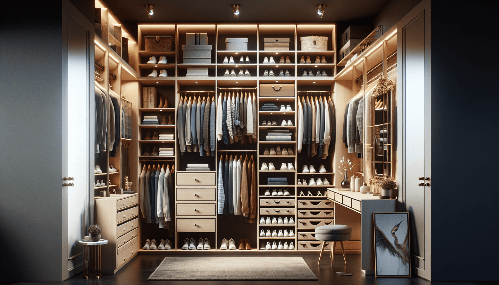
    Opting for a custom closet offers numerous advantages over standard storage solutions, providing a blend of aesthetics, efficiency, and personalized organization. A primary benefit of custom closets is the ability to tailor the design to meet specific needs and preferences, enabling you to optimize every inch of available space. Unlike generic closets, custom closets can fitted with precisely measured shelving, drawers, and hanging spaces that cater to your wardrobe, accessories, and lifestyle.

    One of the most significant advantages of custom closets is the enhancement of organization. Tailored storage solutions ensure that everything has its designated place, reducing clutter and streamlining your daily routines. For instance, custom shelving can configured to accommodate shoes, handbags, and folded garments, while specialized drawers can designed for jewelry, ties, or other small items. The result is a highly organized space where items are easily accessible, saving you both time and frustration during your morning routine.

    Another notable feature of custom closets is their contribution to maximizing storage capacity. By utilizing bespoke designs, you can take advantage of vertical space, awkward corners, and odd-shaped areas that standard closets often cannot accommodate. Custom installations can include adjustable rods and shelves, allowing you to adapt the storage setup as your needs change over time. For example, seasonal clothing can rotated to higher shelves when not in use, ensuring year-round functionality and accessibility.

    Custom closets also enhance the aesthetic appeal of your home. These personalized solutions not only fit seamlessly into your existing decor but can also designed to elevate the overall style of your space. With a variety of materials, finishes, and hardware options available, a custom closet can complement the design elements of your home while adding a touch of luxury.

    Lastly, investing in a custom closet can increase the value of your home. Prospective buyers often appreciate well-organized and aesthetically pleasing storage solutions, viewing them as both desirable and practical features. This added value, combined with the daily benefits of reduced clutter and increased efficiency, makes custom closets a worthwhile investment for any homeowner.

    Designing Your Custom Closet: Factors to Consider

    Creating a custom closet involves careful planning to ensure it meets both your spatial and stylistic requirements. The initial step is to determine the primary purpose of the closet. Will it serve as a wardrobe, a pantry, a home office, or multi-functional space? Each purpose comes with distinct storage needs and spatial considerations that drive the overall design.

    Closet layout is another critical aspect. Assess the available space and identify any structural limitations, such as low ceilings, irregular walls, or existing fixtures. Use these insights to optimize the closet’s layout, promoting both accessibility and maximizing storage capacity. For larger spaces, consider incorporating walk-in or reach-in sections to enhance functionality.

    Storage needs vary based on individual preferences and lifestyles. For wardrobes, prioritize a combination of hanging rods, shelves, and drawers to accommodate different types of clothing and accessories. Consider specialized compartments for shoes, handbags, and jewelry to keep items organized and accessible. For a pantry, adjustable shelving and pull-out baskets can make food storage more efficient.

    Balancing open and closed storage is essential for both functionality and aesthetics. Open storage, such as shelves and display units, offers easy access and showcases items attractively. However, closed storage solutions, like cabinets and drawers, keep less visually appealing items out of sight and protect them from dust.

    Lighting is frequently overlooked but is crucial for a well-designed custom closet. Incorporate a mix of ambient, task, and accent lighting to ensure optimal visibility. LED strip lights along shelves or motion-sensor lights inside cabinets can add both practicality and elegance to the space.

    Material choices significantly influence the closet’s durability and visual appeal. Select materials that align with your style preferences and budget. Options range from classic wood finishes to modern laminates and eco-friendly materials. Quality hardware, such as drawer slides and hinges, also plays a role in ensuring the closet’s longevity.

    Engaging professional designers can provide valuable expertise and innovative solutions. Their experience with space planning, material selection, and functionality can transform your initial ideas into a cohesive and efficient custom closet design. Their insights can help you strike the perfect balance between aesthetics and practicality.

    The world of custom closets has evolved significantly, embracing both functionality and aesthetics to deliver optimal storage solutions. A notable trend is the integration of specialized storage components. Built-in shoe racks are increasingly popular, offering an organized and visually appealing way to store footwear. Jewelry organizers, another favored addition, help keep valuables neatly arranged and easily accessible.

    Practicality meets innovation with the inclusion of pull-out hampers. Which hide dirty laundry until wash day, and rotating wardrobe racks that provide easy access to all items, maximizing the use of space. Moreover, these features often incorporate the latest materials and finishes, reflecting contemporary design preferences. Eco-friendly materials such as bamboo and reclaimed wood highly requested, catering to environmentally conscious consumers. Glass panels add a touch of sophistication and modernity. While high-gloss finishes enhance the overall luxurious feel of the custom closet.

    Innovation doesn’t stop with materials and finishes. The incorporation of technology has revolutionized custom closets, making them not only stylish but also smart. Smart lighting systems that activate upon entry or based on natural light conditions ensure optimal visibility at all times. Automated systems, such as motorized racks and drawers, add a layer of convenience. While climate control features maintain ideal conditions for clothing, preventing damage from humidity or temperature fluctuations.

    Balancing functionality with style is key to creating a custom closet that truly caters to individual needs. Integrating features that enhance convenience and organization. While using high-quality materials and tech integrations, results in a space that is both practical and visually stunning. These trends reflect the ongoing evolution in custom closet design. Where the objective is to provide maximized space usage without compromising on style.

    Maintenance and Upkeep of Custom Closets

    Proper maintenance and care are crucial to ensure the longevity and continued functionality of custom closets. Routine cleaning tips, such as dusting shelves, wiping down surfaces with a gentle cleaner, and vacuuming carpeted areas, should be a regular part of your custom closet upkeep. Regular cleaning helps to prevent the buildup of dust and debris, keeping your space clean and fresh.

    In addition to routine cleaning, best practices for organizing items in your custom closet will also contribute to its long-term functionality. Consider categorizing clothing by type or season, and use uniform hangers to maximize hanging space. Bins and dividers can be used to organize smaller items such as accessories, while clear storage boxes are ideal for shoes and less frequently used items.

    Periodic inspections are essential to identify and address potential issues such as wear and tear or malfunctioning hardware. Check the condition of shelves, drawers, and hanging rods, and promptly tighten any loose screws or replace worn-out components. Inspecting the hardware and structural elements of your custom closet regularly will help to ensure it remains in optimal condition.

    Seasonal wardrobe swaps and reorganization techniques can further enhance the functionality of your custom closet. As seasons change, rotate your clothing to ensure easy access to seasonally appropriate items. This practice not only keeps your closet organized but also allows you to take inventory and purge items that are no longer needed.

    While regular maintenance is manageable for most homeowners, there are benefits to enlisting professional cleaning services. Professionals can provide thorough cleaning, reaching areas that are often overlooked. It may be necessary to consider professional services if your custom closet has intricate designs or materials that require specialized care.

    By following these maintenance and upkeep guidelines, you can ensure that your custom closet remains a stylish and functional space for years to come.

    Top 10 Custom Closet Solutions

    California Closets

    Pros: Highly customizable designs, excellent customer service, extensive range of materials and finishes.

    Cons: High cost, longer lead times.

    Special Features: Walk-in closets, reach-in closets, and wardrobe solutions; specialized storage options for shoes, jewelry, and more.

    Closet Factory

    Pros: Custom designs tailored to individual needs, wide variety of colors and materials, lifetime warranty.

    Cons: Pricey, design process can be time-consuming.

    Special Features: Home offices, entertainment centers, and murphy beds; extensive accessories and storage solutions.

    IKEA PAX Wardrobes

    Pros: Affordable, modular and flexible, easy to reconfigure.

    Cons: Limited customization options compared to high-end brands, assembly required.

    Special Features: Configurable shelves, drawers, and hanging options; stylish doors and finishes.

    EasyClosets

    Pros: DIY-friendly, affordable pricing, fast shipping.

    Cons: Limited to online design tools, not as high-end as custom installations.

    Special Features: Adjustable shelves, rods, and drawers; accessories like shoe racks and basket pull-outs.

    Elfa by The Container Store

    Pros: Versatile and customizable, easy to install and reconfigure, good balance of price and quality.

    Cons: More utility-focused, basic aesthetics.

    Special Features: Shelving, drawers, and hanging systems; variety of configurations for closets, garages, and offices.

    Inspired Closets

    Pros: Professional design services, wide range of finishes and accessories, lifetime guarantee.

    Cons: Premium pricing, availability varies by location.

    Special Features: Custom closet systems for every room, including laundry and pantry storage.

    Modular Closets

    Pros: Affordable, easy to assemble, modular design components.

    Cons: Limited design variety, basic finishes.

    Special Features: Stackable closet systems, DIY-friendly, customizable layouts.

    Closets by Design

    Pros: Full-service design and installation, comprehensive range of products, financing options available.

    Cons: Inconsistent reviews on customer service, higher-priced.

    Special Features: Walk-in and reach-in closets, garage and pantry systems; large array of finishes and accessories.

    Rubin Custom Homes Closets

    Pros: Premium quality, fully bespoke design services, use of luxurious materials.

    Cons: Very expensive, longer turnaround times.

    Special Features: High-end custom closets with unique design elements; personalized storage solutions.

    Space Pro by Homebase

    Pros: Cost-effective, DIY installation, good for small spaces.

    Cons: Limited to specific configurations, UK-based.

    Special Features: Sliding wardrobes, modular components, flexible storage solutions.

    Side-By-Side Vendor Comparison

    Feature/CriteriaCalifornia ClosetsCloset FactoryIKEA PAX WardrobesEasyClosetsElfa by The Container StoreInspired ClosetsModular ClosetsClosets by DesignRubin Custom Homes ClosetsSpace Pro by Homebase
    CustomizationHighHighModerateModerateModerateHighModerateHighVery HighModerate
    Price Range$$$$$$$$$$$$$$$$$$$$$$$$$$$$$$
    Ease of InstallationProfessional ServiceProfessional ServiceDIYDIYDIYProfessional ServiceDIYProfessional ServiceProfessional ServiceDIY
    Material QualityHighHighModerateModerateModerateHighModerateHighVery HighModerate
    Design OptionsExtensiveExtensiveLimitedModerateVersatileExtensiveModularExtensiveExtensiveLimited
    Turnaround TimeLongLongFastFastFastModerateFastModerateLongFast
    WarrantyYesLifetimeLimitedLimitedYesLifetimeLimitedLifetimeYesLimited
    Special FeaturesSpecialized storageEntertainment, bedsModular componentsAdjustable shelvesVersatile configurationsCustom systemsStackable systemsWide range of systemsLuxurious materialsSliding wardrobes
  • Ecommerce Website Design in Brisbane

    Ecommerce Website Design in Brisbane

    Optimize user journeys with tailored ecommerce website design in Brisbane. Learn strategies for understanding the digital landscape & creating a mobile-first design to better reach customers.

    A symbiotic relationship between intuitive ecommerce website design and the vibrant ecommerce landscape in Brisbane

    From Click to Cart: Optimizing User Journeys with Ecommerce Website Design in Brisbane

    In the bustling digital marketplace of Brisbane, the journey from click to cart is a pivotal aspect of successful ecommerce. To master this journey, also an ecommerce website design tailored to the unique dynamics of Brisbane is essential. Join us as we delve into strategies for optimizing user journeys and explore the symbiotic relationship between intuitive ecommerce design and the vibrant ecommerce landscape in Brisbane.

    1. Brisbane’s Digital Pulse:

    Understanding the specific nuances of Brisbane’s digital landscape is crucial. Tailoring your ecommerce website design to reflect the local market ensures that user journeys resonate with Brisbane’s diverse and also dynamic online audience.

    2. Mobile-First Approach:

    Brisbane shoppers are on the move. Optimize user journeys by adopting a mobile-first approach to ecommerce website design. Also, Ensure that your online store is seamlessly accessible and navigable on various mobile devices.

    3. Streamlined Navigation:

    Simplify the user journey with streamlined navigation. Intuitive menus and clear pathways help Brisbane customers find what they need quickly, enhancing their experience and increasing the likelihood of completing a purchase.

    4. Localized Content and Offers:

    Connect with Brisbane shoppers on a personal level by incorporating localized content and offers. Also, Highlighting products or promotions specific to Brisbane fosters a sense of community and relevance.

    5. Fast-Loading Pages:

    Brisbane residents value efficiency. Optimize user journeys by ensuring that your ecommerce website’s pages load quickly. Fast-loading pages not only improve user experience but also contribute to higher search engine rankings.

    6. Brisbane-Centric SEO Strategies:

    Elevate your ecommerce website’s visibility in Brisbane’s competitive online space with local SEO strategies. Also, Integrate Brisbane-centric keywords strategically throughout your content to enhance search engine discoverability.

    7. High-Quality Visuals:

    Brisbane shoppers appreciate visually appealing online experiences. Invest in high-quality visuals and product imagery to create an immersive and also engaging environment that encourages users to move seamlessly from click to cart.

    8. Responsive Design for Multiple Devices:

    Brisbane’s diverse demographic uses various devices. Implement responsive design principles to ensure that your ecommerce website functions flawlessly on desktops, laptops, tablets, and smartphones, also accommodating the preferences of all users.

    9. Transparent Checkout Process:

    Simplify the path to purchase with a transparent checkout process. Also, Streamline form fields, provide clear instructions, and offer multiple payment options to enhance user confidence and reduce cart abandonment rates.

    10. Customer Feedback Integration:

    Brisbane shoppers value the opinions of their peers. Integrate customer reviews and testimonials into your ecommerce website design. Also, Genuine feedback builds trust and influences the user journey positively.

    Conclusion: Mastering Brisbane’s Ecommerce Landscape

    In Brisbane’s thriving ecommerce landscape, mastering the user journey from click to cart is a strategic imperative. Tailoring your ecommerce website design Brisbane’s preferences and behaviours ensures that every click is a step closer to conversion. By adopting these optimization strategies, your ecommerce store can navigate the unique digital pathways of Brisbane, also offering an exceptional online shopping experience that translates into business success.

  • 3 Top Tips for User Experience in Modern Web Design

    3 Top Tips for User Experience in Modern Web Design

    Learn about user interface & user experience in modern web design and find out how to create user-friendly, effective websites. Uncover the three important aspects of having great UX and the differences in various industries.

    3 Top Tips for User Experience in Modern Web Design

    User Experience (UX) and User Interface (UI) are two essential elements of modern web design. They play a crucial role in creating websites that are visually appealing, user-friendly, and effective in achieving their goals. Here are three important details that contribute to a strong UX on a website and how they differ across industries:

    Clear and Intuitive Navigation:

    One of the key aspects of a strong UX is a clear and intuitive navigation system. It should enable users to easily explore and find the information they are looking for. In different industries, navigation styles may vary, view examples here. For example, an e-commerce website may have a more complex navigation structure due to the large number of products and categories, while a service-based website may focus on simplicity and guiding users to the main offerings.

    Inclusive Design:

    To provide a strong UX, it is crucial to consider the diverse needs of users. Inclusive design ensures that everyone, regardless of their abilities or limitations, can access and use a website effectively. This includes making websites accessible to individuals with visual impairments, hearing impairments, motor disabilities, or cognitive disabilities. In different industries, inclusive design may require specific considerations. For instance, an educational website may need to provide alternative text descriptions for images to support visually impaired users, while a financial website may need to ensure optimal keyboard navigation for individuals with motor disabilities.

    Consistent and Responsive Layout:

    Consistency in the layout and design across a website enhances the user experience. Users appreciate familiarity and easily understand how to interact with different elements. Additionally, with the increasing use of mobile and tablet devices, having a responsive design that adapts to various screen sizes is crucial. The importance of consistency and responsiveness may vary across industries, you can visit the following page for more information on how agencies value these principles in their design and development process. For example, a news website may prioritize responsiveness to ensure that users can access the content seamlessly across different devices, while an entertainment website may focus on maintaining a consistent visual style to engage visitors.

    In summary

    UX and UI play integral roles in modern web design. Implementing clear navigation, inclusive design, and consistent layouts are just three important details that help contribute to a strong user experience on a website. Remember, industry-specific requirements and user expectations should be considered to tailor the best experience for each target audience.

  • Get Started With WordPress Design and Development Today

    Get Started With WordPress Design and Development Today

    Optimizing your WordPress design and development for a user-friendly interface, the vast array of themes & plugins, and strong community support. Learn how to create a website that stands out. Introduction to WordPress CMS! Also, Understanding Outreach Meaning and Definition.

    A Comprehensive Guide to WordPress Design and Development

    WordPress has become one of the most widely used content management systems (CMS) for creating websites. It offers a user-friendly interface, a vast array of themes and plugins, and a strong community support system. Whether you are a beginner or an experienced developer, this comprehensive guide will provide you with the knowledge and skills needed to design and develop a WordPress website that stands out from the crowd.

    1. Part: Getting Started with WordPress

    1. Introduction to WordPress: To get started, it’s important to understand what WordPress is and why it has gained such popularity in the web development community. WordPress is an open-source CMS that allows users to create and manage websites easily.
    2. Installing WordPress: Setting up a WordPress site is relatively straightforward. You can choose to install it manually or use a one-click installation provided by your hosting provider. This guide will walk you through the installation process step by step.
    3. Understanding the WordPress Dashboard: Once you have installed WordPress, it’s essential to familiarize yourself with the WordPress dashboard. The dashboard is the central hub where you can control all aspects of your website – from creating and editing pages to managing plugins and themes.
    4. Choosing the Right Theme: With thousands of WordPress themes available, choosing the right one for your website can be a daunting task. This section will guide you through the process of selecting a theme that aligns with your website goals and brand identity.
    5. Customizing Your Theme: Once you have chosen a theme, it’s time to make it your own. WordPress offers various customization options, such as the WordPress Customizer, which allows you to change colors, fonts, layouts, and more. Additionally, you can customize your theme further by editing the CSS and PHP files.

    2. Part: WordPress Design

    1. Design Principles: Good design is crucial for creating a visually appealing and user-friendly website. In this section, we will explore essential design principles such as color theory, typography, layout, and usability.
    2. CSS Fundamentals: CSS is the styling language used to control the appearance of websites. Understanding the basics of CSS will empower you to make design changes and enhancements to your WordPress site. We will cover CSS selectors, properties, and how to target specific elements on your website.
    3. Creating Custom Page Templates: Sometimes, you may want to create custom layouts for specific pages on your WordPress site. This section will teach you how to create custom page templates using PHP, which will enable you to have unique designs for different sections of your website or specific landing pages.
    4. Responsive Design: With the increasing use of mobile devices, it’s crucial to ensure that your website looks great and functions well on various screen sizes. We will delve into responsive design techniques, including mobile-first design, media queries, and responsive images.
    5. Accessible Design: Web accessibility is about ensuring that people with disabilities can access and use your website. It’s essential to follow accessibility guidelines and make your WordPress site inclusive and usable for everyone. We will explore techniques and best practices for creating an accessible website.

    3. Part: WordPress Development

    1. PHP Basics: PHP is the server-side scripting language that powers WordPress. In this section, we will introduce you to PHP and its syntax, variables, functions, and control structures. Understanding PHP basics will help you customize and extend your WordPress site further. How to Find the Perfect Python Web Development Company?
    2. Customizing Themes with PHP: While WordPress provides a range of pre-built themes, you may want to make more significant modifications or add specific functionality. We will cover how to customize WordPress themes by editing PHP files, including template tags, loops, and conditional statements.
    3. Creating Custom Plugins: Plugins are one of the strengths of WordPress. They allow you to add functionality to your site without modifying the core WordPress files. In this section, we will guide you through the process of creating your custom plugins, using PHP code to extend and enhance your WordPress site.
    4. Working with the WordPress REST API: The WordPress REST API enables you to interact with your WordPress site’s data programmatically. We will explore how to use the REST API to retrieve, create, update, and delete data, opening up possibilities for building mobile apps, integrating with third-party services, and more.
    5. Optimizing Performance: Website performance is crucial for user experience and search engine optimization. We will cover techniques to optimize your WordPress site’s performance, such as caching, image optimization, minimizing JavaScript and CSS files, and using a content delivery network (CDN).

    4. Part: Advanced Topics

    1. Security Best Practices: WordPress is a popular CMS, making it a target for hackers. We will discuss essential security practices, including keeping your WordPress installation and plugins up to date, using strong passwords, implementing security plugins, and securing your hosting environment.
    2. Search Engine Optimization (SEO): To ensure your WordPress site ranks well in search engine results, you need to optimize it for SEO. We will cover keyword research, on-page optimization, creating useful content, optimizing site speed, and building quality backlinks.
    3. Multilingual Websites: If you are targeting a global audience, offering a multilingual website is essential. We will explore different methods for creating multilingual websites using WordPress, including plugins and multi-site installations.
    4. E-commerce with WordPress: WordPress is widely used for building e-commerce websites. We will discuss popular e-commerce plugins, such as WooCommerce, and guide you through setting up and customizing an online store with WordPress.
    5. Troubleshooting and Maintenance: Like any software, WordPress can have issues that need troubleshooting. We will cover common problems and their solutions, including resolving plugin conflicts, fixing these issues, and troubleshooting performance problems. Additionally, we will discuss regular maintenance tasks, such as backups, updates, and security audits.

    By following this comprehensive guide, you will gain the necessary skills to design and develop stunning WordPress websites. Whether you are creating a personal blog, a business website, or an e-commerce store, WordPress provides endless possibilities for customization and expansion.

    How to Get Started With WordPress Design and Development Today

    Are you eager to dive into the exciting world of WordPress design and development? Look no further! This step-by-step guide will help you get started with WordPress and empower you to create stunning websites. Let’s begin:

    Step 1: Familiarize Yourself with WordPress

    To start, learn about WordPress and why it’s a popular choice for website creation. WordPress is an open-source content management system that allows you to design and manage websites with ease. It provides a user-friendly interface, a wide range of themes and plugins, and excellent community support.

    Step 2: Install WordPress

    Setting up a WordPress site is straightforward. You have two options: manually install WordPress or use a one-click installation provided by your hosting provider. If you prefer a manual installation, follow the step-by-step instructions detailed in the WordPress Codex. Otherwise, check with your hosting provider for a simple one-click installation process.

    Step 3: Understand the WordPress Dashboard

    Once WordPress is installed, familiarize yourself with the WordPress dashboard. The dashboard is your central hub for managing all aspects of your website. From creating and editing pages to managing plugins and themes, the dashboard gives you full control. Spend some time exploring its features and getting comfortable with the different options available to you.

    Step 4: Choose the Right Theme for Your Website

    With thousands of WordPress themes available, choosing the right one for your website can feel overwhelming. Take your time and browse through various themes to find one that aligns with your website goals and brand identity. Consider factors like design, layout options, customization options, and responsiveness across different devices.

    Step 5: Customize Your Theme

    After selecting a theme, it’s time to make it your own. WordPress offers several customization options to help you personalize your website further. Start by using the built-in WordPress Customizer, where you can customize colors, fonts, layouts, and more. If you have coding knowledge, you can also modify the CSS and PHP files to achieve a more tailored design.

    Step 6: Learn Design Principles

    Good design is essential for creating visually appealing and user-friendly websites. Familiarize yourself with design principles such as color theory, typography, layout, and usability. This understanding will help you create captivating and engaging websites that leave a lasting impression on your audience.

    Step 7: Dive into CSS

    CSS (Cascading Style Sheets) is the language used to style websites. Understanding CSS basics will empower you to make design changes and enhancements to your WordPress site. Learn about CSS selectors, properties, and how to target specific elements on your website. This knowledge will enable you to create unique and eye-catching designs.

    Step 8: Explore Responsive Design

    In today’s mobile-driven world, responsive design is crucial. Ensure your website looks great and functions well on various screen sizes. Dive into responsive design techniques such as mobile-first design, media queries, and responsive images. By implementing these techniques, you’ll deliver an optimal user experience across devices.

    Step 9: Embrace Accessibility

    Creating an accessible website is essential to reach as many people as possible. Explore techniques and best practices for making your WordPress site inclusive and usable for everyone. Learn about accessibility guidelines and implement them to ensure that people with disabilities can access and navigate your website easily.

    Step 10: Expand Your Knowledge with WordPress Development

    As you become more comfortable with WordPress design, consider expanding your skills into WordPress development. Learn the basics of PHP, the server-side scripting language that powers WordPress. This knowledge will enable you to customize and extend your WordPress site further, making it truly unique.

    Congratulations! You are now on your way to becoming a WordPress design and development expert. Remember, practice makes perfect, so keep experimenting and exploring the vast possibilities that WordPress offers. Happy designing and developing!

    Bottom line

    This comprehensive guide provides a step-by-step approach to WordPress design and development. It covers topics such as getting started with WordPress, choosing and customizing themes, design principles, CSS fundamentals, creating custom page templates, responsive design, accessible design, PHP basics, customizing themes with PHP, creating custom plugins, working with the WordPress REST API, optimizing performance, security best practices, SEO, multilingual websites, e-commerce with WordPress, troubleshooting and maintenance. By following this guide, readers will gain the necessary skills to design and develop stunning WordPress websites.

  • The Art of Minimalism in Bedroom Design

    The Art of Minimalism in Bedroom Design

    The art of minimalism is not merely a fleeting design trend; it’s a profound philosophy and a lifestyle choice. At its essence, minimalism propounds the notion that by shedding the superfluous, we can foster spaces that exude calmness, serve functionality, and genuinely echo our ethos.

    The Art of Minimalism in Bedroom Design: How Less Can Truly Be More

    The bedroom, a sanctuary for repose and rejuvenation, becomes the perfect canvas for minimalist principles.

    The Art of Minimalism in Bedroom Design Image
    Photo from ilearnlot.com

    1. Streamlined Furniture:

    Furniture forms the backbone of any bedroom. For a minimalist approach, pieces with unfussy, clean lines are pivotal. Consider a bed frame without an ornate headboard or footboard. A straightforward bedside table can house essentials without contributing to clutter. Sleek, modern wardrobe doors not only serve their primary function but can significantly enhance the spacious feel of a room.

    2. Neutral Color Palette:

    Neutral shades are the hallmark of minimalist design. Soft whites, beiges, and grays, with their innate calming effect, are perfect for bedrooms. A hint of black or navy can introduce a touch of sophistication without becoming overpowering. For those keen on exploring the myriad ways to utilize neutral palettes in minimalist bedrooms, Architectural Digest offers a trove of inspiration.

    3. Decluttered Spaces:

    A clutter-free environment is the soul of minimalism. Regular audits of bedroom items become essential. If an object neither serves a functional purpose nor augments the room’s serenity, it might be time to reconsider its presence. Such regular decluttering ensures the bedroom remains a true sanctuary.

    4. Functional Decor:

    In a minimalist setting, every piece has its place and purpose. For decor, consider items that marry aesthetics with utility. A chic wall clock, for instance, tells time and adorns a wall. A beautifully crafted lamp can illuminate the room while serving as a design piece.

    5. Focal Points:

    With minimalism, it’s not about quantity but the impact. Instead of scattering multiple artworks, perhaps choose one significant piece that commands attention. This could be a contemporary painting, a monochrome tapestry, or even a set of artistically designed wardrobe doors.

    6. Quality over Quantity:

    The minimalist approach champions the idea of investing in fewer items of higher caliber. Such pieces, while possibly pricier initially, often endure longer, exuding timeless elegance. Elle Decor stands as a testament to this concept, showcasing a range of premium furniture and decor options that stand the test of time.

    7. Textures and Layers:

    While minimalism veers towards simplicity, it doesn’t shy away from depth. Introducing different textures through bed linens, rugs, and curtains can add layers to the room without making it feel overwhelmed. A simple linen curtain, a knitted throw, or a woven rug can elevate the sense of luxury in a minimalist bedroom.

    8. Natural Elements:

    Incorporating natural elements can breathe life into a minimalist bedroom. Whether it’s a potted plant, wooden furniture, or stone accents, these elements bring warmth and grounding to space.

    In conclusion

    The art of minimalism in bedroom design is an exercise in restraint and intentionality. Through judicious choices in furniture, color, and decor, and by giving primacy to features like wardrobe doors, you’re poised to craft a bedroom that, while minimalist in design, is maximalist in comfort, style, and tranquility.

  • How to Best Tips to Ace the NATA Entrance Exam

    How to Best Tips to Ace the NATA Entrance Exam

    The Ultimate Guide and Tips to Passing the Nata Entrance Exam. Are you looking to study architecture? If so, you’ve come to the right place! The NATA is a national-level exam that you can take to get into an architecture college in India. It’s administered by the Council of Architecture in New Delhi. Also, The exam consists of 100 questions and lasts 3 hours. So if you’re interested in studying architecture, here’s a comprehensive guide to getting ready for the NATA.

    How to Best Tips to Ace the NATA Entrance Exam: From Exam Pattern to Design Principles

    Table of Contents:

    • Introduction
    • Understand the NATA Exam Pattern
    • Practice Previous Year’s Question Papers
    • Join a Coaching Institute
    • Improve your Drawing Skills
    • Understand the Principles of Design
    • Conclusion

    Introduction:

    Aspiring architects need to clear the National Aptitude Test in Architecture (NATA) to get admission to the top architecture colleges in India. NATA is a highly competitive entrance exam that tests candidates’ drawing and observation skills, aesthetic sensitivity, critical thinking ability, and sense of proportion. In this article, we will provide you with the best tips and strategies to achieve success in the NATA entrance exam.

    Understand the NATA Entrance Exam Pattern:

    The first step towards achieving success in the NATA exam is to understand its pattern. NATA consists of two parts: Part A and Part B. Part A is a computer-based online test that assesses candidates’ aesthetic sensitivity, analytical skills, and mathematical ability. Part B is a pen-and-paper-based drawing test that evaluates candidates’ drawing and also observation skills.

    Practice Previous Year NATA Entrance Exam Question Papers:

    One of the best ways to prepare for the NATA exam is to practice the previous year Nata question papers. By solving previous year’s question papers, you can get a good idea of the exam pattern, the type of questions asked, and the level of difficulty. Additionally, it helps in improving your time management skills and identifying your strengths and weaknesses.

    Join a Coaching Institute:

    Joining a coaching institute can be beneficial for candidates who need guidance and structured preparation for the NATA exam. Coaching institutes provide students with comprehensive study material, regular mock tests, and expert guidance from experienced faculty members. Additionally, they also help in improving your drawing and observation skills, which are crucial for the NATA exam.

    Improve your Drawing Skills:

    Drawing and observation skills are essential for the NATA exam, and candidates must improve them to achieve success. One way to improve your drawing skills is by regularly practicing sketches, drawings, and paintings. Additionally, you can also enroll in art classes or workshops that can help in enhancing your artistic abilities.

    Understand the Principles of Design for the NATA Entrance Exam:

    Understanding the principles of design is crucial for the NATA exam, as it tests candidates’ sense of proportion and composition. Candidates must have a good understanding of the principles of design, such as balance, harmony, rhythm, and proportion, to achieve success in the exam. Additionally, they should also be aware of the latest trends and styles in architecture.

    Conclusion:

    Clearing the NATA exam requires dedication, hard work, and a structured preparation strategy. Candidates must understand the exam pattern, practice the previous year’s question papers, improve their drawing skills, join a coaching institute, and understand the principles of design to achieve success. By following these tips and strategies, candidates can increase their chances of cracking the NATA exam and also getting admission to the top architecture colleges in India.

    How to Best Tips to Ace the NATA Entrance Exam Image
    How to Best Tips to Ace the NATA Entrance Exam; Image by F1 Digitals from Pixabay.
  • What is the Prospect of Web UI Interface Design?

    What is the Prospect of Web UI Interface Design?

    Web UI Interface Design Prospect; The banner column is promotional and is an important way to convey information about the whole site on the web page, it is the easiest for the viewer to view. The text of the banner column has the properties of unity and identification, and the design tends to be graphic. The navigation bar is a map-like column. In the layout of the navigation bar, the text is the best user guide.

    Here are the articles to explain, Prospect of Web UI Interface Design

    The design effect of the text in the navigation bar determines whether the viewer can quickly find the target page. The types of websites are complex and have different attributes. When designing webpage text, factors such as the user’s age, gender, occupation, cultural background, and economic level must be fully considered. Web page “layout” is the design of the content size, spacing, and position of the page. A good layout can effectively help users find the target content quickly, and give users enjoyment in visual effects.

    A reasonable layout must have a clear visual hierarchy and intuitively reflect the important gradients between the elements of the web UI interface. Also, The first area that users pay attention to is important elements such as logos, LOGOs, and navigation bars. To reflect the visual hierarchy, it is also necessary to consider the logic and browsing habits of the interactive characters when designing the visual flow.

    Multi-media design

    Multimedia technology refers to the technology that combines multiple single media. Multimedia technology integrates various visual and auditory media, including animation, text, graphics, images, language, music and stereo, etc. Also, The multimedia web UI interface allows users to receive various media information sources at the same time. The use of multimedia technology in web UI interface design can reflect the following characteristics:

    • 1) Integration, unified acquisition, and processing of remote multimedia audio and video information.
    • 2) Interactive, humanized information dissemination, able to actively select and control the direction of information flow.
    • 3) Non-linear, creating a hypertext link method to flexibly display browsing content.
    • 4) Real-time, real-time control of multimedia information, and timely cooperation with user instructions.
    • 5) Also, Dynamic, users can choose the way of using information according to their own needs, and even reorganize various forms of information.

    Web Interaction Design

    Interaction design needs to solve the problem of interaction between humans and machines, which is something on the presentation layer. A good interaction design scheme can make users feel that the webpage is advantageous. What kind of web interaction design is a good solution?

    Make people wait patiently.

    According to network surveys, most users wait for a webpage to open for up to 5 seconds. If the page cannot be opened within 5 seconds, then the content on this page will be meaningless. Therefore, when designing the interaction. It is necessary to consider the information provided to the user when the web page is waiting. The best way is feedback. When the user is waiting, tell the user whether his operation is successful and present the remaining waiting time in real time. Which can effectively solve the problem that the user cannot wait patiently.

    Make people think without using their brains.

    A good website can help users complete tasks quickly. To achieve the goal of quickly completing tasks, the interaction design must make the page simple, try to keep users from unnecessary interference when browsing, and preferably conform to the user’s mental model. Because most users want to quickly find a solution that is barely enough when browsing the website, and they are not willing to actively look for a solution. Eighty percent of users will only use 20 percent of the functions.

    Prospect of Web UI Interface Design

    The web UI interface design is mainly a three-dimensional visual interface and a two-dimensional graphical interface, supplemented by multimedia plug-in layout design such as animation and sound. With the continuous development of computer technology, the three-dimensional operation interface system will gradually become popular in web design. The direct operation of the three-dimensional interface is an important way of expressing the interactivity of virtual reality (Virtual Reality).

    The direct operation in the three-dimensional virtual space includes operations such as translation, picking, and rotation, such as cutting-edge 3D shadow installation and multi-touch technology. The three-dimensional direct operation makes the design of web UI interface no longer limited to the three-dimensional transformation of visual effects but can realize direct human-computer interaction similar to four-dimensional space to better complete user operations.

    In conclusion

    For decades, web UI interface design has gone through different stages of development, and various styles are popular. The current web UI interface is in the era of graphical user interfaces. As a web designer, it is not enough to satisfy this status quo. It needs to cooperate with computer scientists and Work together to actively explore human-computer interaction technology with new interface styles. The main task of modern web UI interface design is to effectively combine the user’s actual work process, task model, behavior mode, and mental model, and reasonably convert it into an implementation model of the interface product content, to present a user interface as close as possible to its own. Real characters, interface product system models that meet high aesthetic standards.

    What is the Prospect of Web UI Interface Design Image
    What is the Prospect of Web UI Interface Design? Photo by Alvaro Reyes on Unsplash.
  • Website Design Certificate Programs Excellent Courses

    Website Design Certificate Programs Excellent Courses

    How do Website Design Certificate Programs Courses? The country stipulates detailed technical standards for the videos of quality courses. It recommends using MKV, Rmvb, rm, WMV, asf, Flv, or Avi formats for video files on the server side. It recommends that the video format be at least 300kbps in total bitrate, 30fps in frame rate, and 320×240 in size. For the initial shooting of videos, schools can generally achieve high-definition. Once compressed into a network format, many high-quality courses do not pay attention to the quality of the video and do not implement compressed videos by national standards.

    Here are the articles to explain, Review of Website Design Certificate Programs Excellent Courses

    There are many videos on the Internet of many high-quality courses. Streaming media formats such as WMV or asf formats use after compression. Either the frame rate or the bit rate cannot meet the requirements, which reduces the video quality. An unclear video is very difficult to attract students to learn. As far as video content is concerned, many high-quality courses use the process of directly recording the teacher’s lectures, and adding pictures, videos, animations, subtitles, voice-overs, etc. in post-production.

    Some schools do not do much of this kind of work or do nothing at all, which greatly reduces the effect of video playback. It is very boring for students to only watch a non-dynamic picture of a teacher’s lecture plus the teacher’s voice. There are still many problems, which will not list one by one here. Given the above problems, combined with the high-quality courses produced by our school, the author believes that the preliminary preparation work is very important for the website content design of high-quality courses.

    The purpose of presenting a course on the Internet is not to show off how good the interface of the webpage is, let alone how good the content inside is. The most important thing is to make it acceptable to students, and the needs of students should be the first element. However, due to the influence of traditional education, students’ learning is more or less passive. Therefore, in the design process, we must strive to be concise and the links should not be too deep. Students think of the content of learning. Level navigation can use to learn the content, to attract students. The specific design process is as follows:

    Navigation design

    The content of the navigation of excellent courses generally includes columns such as teaching documents, video classrooms, online exercises, online tests (message boards), online discussions, extended learning, and policies and regulations related to courses. Most importantly relevant content is classified, and some irrelevant or insignificant columns cannot place, so as not to arouse students’ disgust.

    Layout design

    The layout design of excellent courses is mainly concise and clear. Take Qinghai TV University’s excellent course “Basic and Practice of Taxation” as an example. The pixel design of the display part of the entire webpage is 960×700, and the theme or animation of the header course design at 960×80 ~120 (the height of the head can increase or decrease according to different courses), the design of the navigation is to insert a single-line table in one line and put each navigation content into each cell of the single-line table. The header and navigation are common to all web pages.

    In the process of designing sub-columns. For example, when designing the layout of teaching documents, the middle is divided into two parts: the left and the right. The left side is for teaching documents such as syllabus and implementation plan, which is the content navigation of teaching documents. The width of the navigation cell on the left is The design is 200px. An embedded frame web page design is on the right, and the size of this frame is 760×490. All the navigation content in the teaching file on the left is displayed in this embedded frame. When browsing, the entire web page does not move, click to switch For the navigation on the left. The corresponding content is displayed in the embedded frame on the right, and the scroll bar can be dragged in the embedded frame.

    Other columns

    Other columns are designed in the same way to achieve the unity of page design, and the width of the embedded frame can adjust appropriately according to the different display contents. For a navigation column, if there are sub-columns, the most commonly used method is to use the foldable menu to display the content. The display of the foldable menu can realize with simple code. This kind of display code is very common on the Internet. From other web pages Just quote it. During the production process, we found that the second-level columns are the most readable.

    Therefore, the column design of an excellent course generally does not exceed the third-level columns. Many high-quality courses produced by universities (such as Tsinghua University’s high-quality courses) also adopt a unified template, that is, the pattern, color, and navigation content of the webpage are the same, the difference is the content and some special columns for each course itself. The author thinks that for a certain school, it is advisable to form the template of the school-style excellent courses.

    The biggest advantage is that when making excellent courses in the future, the designers do not need to rack their brains about how to design the pattern or color of the webpage, Just use ready-made templates to replace the content of the webpage. This method will greatly improve the efficiency of making high-quality courses. If you do more, a specific model of a certain school’s high-quality courses will naturally form on the Internet.

    Video processing

    • First of all, the recording of the teacher’s lecture video needs to be done in high-definition.
    • Secondly, for the video content mentioned by the teacher, it is necessary to prepare sufficient materials, including texts, pictures, additional videos, and animations made for certain content, and then perform fine production in non-linear editing software to truly achieve both pictures and texts, to attract the attention of students.
    • Thirdly, the video after production must compress to adapt to online playback. You can choose WMV, Flv, Rmvb, and other formats, but you must pay attention to the clarity of the compressed video. Based on national standards, compression can only be better than the national standard. The standard should not be too high.
    • Finally, put the finished video on the webpage in a suitable way. You can directly link to the video for online playback, or make it into a three-screen webpage. The effect is more ideal. Content navigation and handout text (or PPT) divide into three areas.

    Now in many high-quality courses, videos are often presented on a three-split screen. Automatically generated three-screen video courseware is very popular now, that is, teachers use PPT or text when giving lectures. During the recording process, the teacher’s lectures and PPT operations are recorded together. After the recording is complete, an index is automatically generated, that is, navigation. This method adopts in our school’s excellent course “Fundamentals and Practice of Taxation”, and the effect is very good.

    Content design

    Whether an excellent course can attract students to learn in website design certificate programs. The most important thing is that the content placed should be suitable for students to learn. So all factors should consider in the design of the column, and the content prepared in each column is based on the course. Highlight the key points and make a comprehensive summary. Specifically, the video course is the most important, and it must not be a remedial explanation. Relevant teaching documents and practice questions are essential, and auxiliary expansion content, etc., place as needed. In the extended content, you can put some tutorial videos or videos related to the course.

    Whether it is a self-made video or a video taken from the Internet, try to choose a video with higher quality. The font size of the text in the online excellent courses is generally 10 fonts. Which is the default font size of the text displayed on the web page. The author believes that it is better to choose a slightly larger font size for excellent courses.

    Text size

    Usually, the title fixes to boldface 14 The main text fix in 12 fonts in Song Dynasty. It is ideal for the line spacing of text web pages to be 1.5 times the line spacing. You can also adjust the font or font size according to the content of the text. If you quote a short story or a famous quote from a famous person, you can use italics to express it.

    The learning content that students are more likely to accept is video, animation, and sound. Reading text is the most boring. Therefore, when making, try to use videos where videos can use, and animations where animations can use. Make web pages as vivid as possible to enhance the readability of excellent courses.

    Production of practice questions

    In high-quality courses, the practice questions are often presented in the form of online tests. The practice questions generally include fill-in-the-blank questions, single-choice questions, judgment questions, multiple-choice questions, etc., and flash can be used in the production process, such as the production of fill-in-the-blank questions. In the excellent course “Regional Culture·Qinghai Provincial Love”, the filling-in-the-blank questions implement in the form of flash.

    The difficulty in making the filling-in-the-blank questions lies in the uncertainty of the content of the fill-in-the-blank questions. Which can solve by using a simple sentence in flash. question. For single-choice questions, multiple-choice questions, etc., there are ready-made codes on the Internet. It can realize by downloading one and replacing the corresponding content. In some high-quality courses, online examination content also design. Regarding the online examination system, there are many ready-made source codes on the Internet.

    For example

    There is various source codes on the “Source Code House” website. You can download one and make simple modifications. It is best to use the ASP/Access method, which does not affect the database. It is very convenient to modify, and it is also easy to carry out background maintenance. The process of uploading questions, students’ online examinations, and marking papers can easily complete. As a high-quality course, it does not need a professional examination system. Therefore, this method is the fastest and most practical.

    For the post-update of high-quality website design certificate programs courses, it is appropriate to use dynamic web pages, and static web pages can generally use for those with fewer post-updates. The evaluation standard of excellent courses lies in the degree of recognition of the students. It is not just whoever makes the webpage beautiful or who makes a lot of content. The learning needs of students come first. The presentation and the readability of the content should be carefully and meticulously handled so that a good quality course can produce.

    Review of Website Design Certificate Programs Excellent Courses Image
    Review of Website Design Certificate Programs Excellent Courses; Photo by Brooke Cagle on Unsplash.
  • Website Design and Mobile App Design Difference

    Website Design and Mobile App Design Difference

    What is the difference between Website and Mobile App Design? More than designers in other fields, web designers need to work fully with people who have mastered these skills. Mobile application design, as the graphic user interface design and interactive design of third-party smartphone applications, takes the mobile Internet as a platform, and gradually brings users into a period where they are used to using mobile clients to surf the Internet. In application design, beauty needs to convey by function, and each interface element must focus on the needs of the current user.

    Here are the articles to explain, The Difference Between Website Design and Mobile App Design

    At present, various mobile phone applications emerge in an endless stream, and their number can be called overwhelming. On the AppStore or other platforms, mobile phone applications are roughly divided into several categories. System tools, audio-visual entertainment, web browsing, office reading, social communication, life encyclopedias, shopping, games, etc. The difference between website design and mobile app design:

    Different user experiences

    (1) Differences in the characteristics of media

    Traditional websites are browsed through computer terminals. While mobile applications are used and operated through smartphone terminal platforms. The operating medium has different characteristics and user usage statuses. In comparison, to the website and mobile app design, phones are more flexible and can carry around, and users can complete operations while walking. Because of this, it’s nothing like the app you see as a designer.

    (2) Mouse click and touch screen

    When the user uses the computer to surf the Internet. He uses the mouse to operate the interface: single click, double click, right button, and scroll wheel. The hot zone (clickable) for user operation is usually in the upper middle of the web page. The accuracy of the operation with the mouse is strong, and the small buttons will not cause misclicks. When users use mobile applications, they usually operate with their thumbs. And only one-third of the screen is easy to reach, that is, the area that the thumb can reach (under the premise of one-handed operation).

    For an ergonomically comfortable experience, designers should place the primary click target in a hotspot that is convenient for thumb clicks. So this is why toolbars and tab bars are generally placed at the bottom of the screen. While in traditional computer interfaces, it is customary to place menus at the top of the screen or window. But due to our limited thumb hotspot, the main click target falls to the bottom of the phone screen.

    How to organize the visual hierarchy of click targets is a factor for designers to consider. Commonly used buttons and navigation can be placed on the left side of the screen. And infrequently used buttons and click targets that change data can be safely tucked in the upper right. For example, the “delete” and “edit” buttons for sorting list items are generally placed in the upper right corner. Which can reduce misunderstandings.

    (3) Physical metaphors

    When users use the touch screen of a smartphone, they will find its obvious physical metaphor: sliding the screen, clicking the button, stroking the digital wheel, dragging the map, and zooming in and out of the picture with the thumb and index finger. Users can easily manipulate these interactions because they behave exactly like real-world objects.

    This is due to the sensing devices that come with the mobile phone: gravity sensor, acceleration sensor, direction sensor, orientation sensor, three-axis gyroscope, distance sensor, light sensor, air pressure and temperature sensor, ultraviolet sensor, etc. Designers can take advantage of these physical properties to create more interesting interactive experiences. And these are sensing systems that traditional computer screens just can’t have.

    (4) Advantages of mobile applications

    Compared with traditional websites, the affiliated applications of the website have the following advantages:

    Efficiency—In mobile scenarios, one of the most important user needs is efficient use. Good websites will redesign the app to improve the experience of the corresponding part of the site. Taobao’s comprehensive e-commerce website has designed a unique mobile platform application. Compared with the Taobao website directly opened by the Safari browser, the Taobao application interface is more concise, and each icon represents the most important part of the Taobao homepage. function, hide or omit the secondary function information, which is convenient for mobile phone users to find and use.

    More vivid and beautiful interactive dynamic effects—the website application based on the smartphone platform can use the dynamic controls provided by the mobile phone to display the content more vividly. Although the close effect can simulate through Web technology, the realistic physical dynamic effect of the mobile phone cannot simulate.

    Temporary storage function—one of the advantages of some mobile applications compared with the corresponding sites is that the application can pre-store content for offline reading. For example, the interactive sharing and personalized reading application Zaker provides downloading of all the latest information, microblogs, blogs, newspapers, magazines, pictures, rss, google reader, and many other contents when online, and selects the layout area according to the user’s wishes The content of the block is composed, and the articles downloaded after offline can be read in the blind area of ​​the network.

    Differences in interface design

    (1) Different interface layouts

    The traditional network platform uses computers as the communication medium. The size of the screen display restricts the size of the webpage. The common size is 1000 pixels (screen width) × 768 pixels (screen length). The screen length of the web page determines according to the content and function. The common ones are two screens and three screens. The interface size of the website and mobile app or application design is closely related to the size of the display screen of the mobile phone. For example, the size of the iphone3G is 320×480 pixels, and the size of the iphone4 is 960×640 pixels.

    The above comparison shows that the size of web pages is much larger than that of mobile phone applications. Living in a palm-sized screen, every piece of space is “an inch of land and an inch of gold”. The interface layout of web design mainly composing of an advertising area, a navigation area, and a page content area. The navigation area usually distributes on the top or left side of the interface. This arrangement is to ensure that each column of the navigation can completely see on the first screen. The advertising area is usually located near the navigation area, occupying the core position of the page.

    The interface layout of the web page generally divides into “country” type, corner type, title body type, left and right frame type, top, and bottom frame type, comprehensive frame type, etc. What kind of layout to choose should reasonably design according to the content and functions that the page needs to contain. The interface layouts of mobile applications and websites are both different and related.

    Additional

    Based on the characteristics of the mobile phone screen in the interface layout, important information should place at the top, and important operations should be placed at the bottom. A common mobile application layout is the tab bar layout, which divides into upper, middle, and lower parts.

    Usually, the tab bar and toolbar places at the bottom of the screen. The navigation bar is set at the top of the screen, and the middle part is the content area. When designing a mobile application, try to display the page on one screen and avoid scroll bars. Reduce on-screen elements and hide advanced tools and actions. Tiled pages: This layout often use for pages that form a hierarchy, and swiping the screen can switch pages. A row of small dots at the bottom of the page are page-paging control icons.

    The number of small dots represents the number of pages. And the highlighted dots represent the position of the current page, which can flip as needed. This page layout generally contains less than 10 pages. Tree structure/list layout: This layout often uses for pages with many levels. Clicking on a single list bar can expand the page or enter the next level of the page. It is also easy to go back to the previous page. These layout methods can use in combination according to the specific situation of the information to achieve an efficient and good user experience.

    (2) Processing of text information

    Paragraphs of text on the Web stand also known as “text”. Text is the most essential form of information transmission on the Web. Still, there are too many texts and large sections of text. Such as complex and meaningless explanatory text and lengthy links can only slow down the browsing speed of users.

    • Avoid long paragraphs of prose;
    • Use headings, phrases, and bullets for paragraph-shaped text.

    In Web layout, text paragraphs stand generally used in the divided page content area. There are several text-carrying blocks in its mobile app:

    • The Tab bar use to display very short text;
    • Text view: use to display text fields;
    • Text input box: text input area.
    (3) Buttons and auxiliary icons

    On web pages, there are buttons in the navigation bar, input form, search, and other panels. A button prompts the user to click and complete a function. Buttons stand generally composed of graphics (background color blocks) and text and usually have two states. Download preview state (when the mouse does not click); and the state of mouse passing or pressing. The interface button of its mobile phone application is the most basic style in the mobile phone interface—a rounded rectangle button and the button contains text or graphics.

    As shown in the picture, the auxiliary icon of the camera adds to the button on the left side of the navigation area, which is simple and clear. The blue three-dimensional button contrasts the navigation bar and is very unified. On the right is the delete button, which stands emphasized and hinted at in red.

    Button types;

    Buttons in mobile applications usually have the following states:

    • In the preload state, that is, the original state without touch.
    • The state when pressed usually highlights.
    • The state after clicking and touching.
    • The feedback after clicking and touching is very important to the design of mobile phone applications.

    It prompts the user’s current operating state. We can prompt by changing the background color, changing the icon picture, or changing the text color. There are also functional auxiliary icons on the website, such as play icons in the player indicating various functions, forward and backward arrows with page-turning functions, etc. The icon system of the mobile application is richer and more powerful. One type of icon for the mobile application is for the tab bar, and the other type is for the navigation bar and toolbar.

    (4) Navigation design

    In traditional web pages, navigation is the “hub” of the website, just like the catalog page in a book. Through navigation, you can understand the information architecture classification of the entire website and help users locate it. Navigation design is based on user needs and technical possibilities, integrating interaction, interface, and graphic design. Because the content of the website is leading, so that users can guide themselves to find the information they need, an efficient navigation system is often the first demand of users who visit the website for the first time.

    Website navigation mainly divides into main navigation, secondary navigation, local navigation, and contextual navigation. The hierarchical structure is a typical organizational method for information in the network. A multi-level website interface will have an important impact on whether users can smoothly find the information they need. Compared with directly entering the home page, more people arrive at a certain page through a search, E-mail, or advertising links. One of the most important factors is that the navigation system should show the scope and context of the information on the page to help people measure and determine its relevance.

    Design Thinking Connections

    The user research can predict the specific use process and understand the user’s operation behavior. The user group here limit by age, gender, occupation, Internet access method, and computer and network technology level – research the actual user group. For example, whether the text of the website serving the older people user group should consider larger (the commonly used text on the Internet is Song typeface 5). Whether the distance needs to adjust, and whether it is necessary to add functions that stand only used by older people users, etc. In the design of the website and mobile app applications, customers and users should also carefully analyze, and deficiencies in the application should regularly revise according to user feedback.

    Conclusion

    After discussing the differences and connections between the website and mobile app design. For its subsidiary application design, we need to conduct detailed user and customer analysis when designing a mobile subsidiary application and conduct in-depth investigations into the layout characteristics, functions, and services of the original website. From it, find out where the mobile phone subsidiary applications can use for reference and play.

    On this basis, according to the different characteristics of mobile application layout, navigation, buttons, text, and other elements, the information stands reasonably sorted and visualized. Design thinking using metaphors makes design closer to life, minimizes barriers to use, and enables users to get a good product experience. And summarize and modify the application in repeated user feedback, and gradually improve the design.

    The Difference Between Website Design and Mobile App Design Image
    The Difference Between Website Design and Mobile App Design; Photo by Kelly Sikkema on Unsplash.
  • New Product Development Process PDF under Design

    New Product Development Process PDF under Design

    Introduces the connotation of analytical design management pdf the importance of the new product development process to enterprise development, and the functional management of design management in the new product development process. Due to fierce market competition, shortening the time for new products wins the opportunity. Design runs through and dominates the entire new product development process. Pay attention to the role of design management in the development of new products. Then improve the competitiveness of enterprises in the market.

    Here are the articles to explain, New product development process pdf under design management mode

    Main Keywords: design; design management; new product development process pdf; gate

    Loader Loading…
    EAD Logo Taking too long?

    Reload Reload document
    | Open Open in new tab

    Download [120.13 KB]

    With the development of globalization and the diversified needs of consumers. Enterprises must continuously develop new products to cope with fierce market competition. So the product life cycle is shortening year by year. Customers are becoming more and more demanding of products, and their desire for new products is getting higher and higher. Enterprises must have a product mechanism that can continuously develop products according to market demand. The product development process is the most important aspect of R&D management. The systematic product development process must be cross-functional. Excellent products will not produce naturally in the enterprise. It needs to complete through a series of effective management. The design has become the key to creating products to increase added value, and strengthening the combination of design and management is an effective way to further improve the new product development process with pdf.

    The meaning and necessity of design management

    So far, there is no unified definition of design management. Because design and management have different meanings when considered from two different background disciplines. The definition of design management currently accepted by most scholars refers to:

    “Defining design problems and goals, finding suitable designers, integrating, coordinating or communicating the resources needed for design, using management methods such as planning, organization, supervision, and control, and seeking The most appropriate solution, and through the management of design strategies, strategies, and design activities, solve problems in a timely and effective manner within the established budget, and achieve the intended purpose.”

    In developed countries such as Europe, America, and Japan, companies have a set of systematic methods to manage design to ensure the smooth progress of the entire product development process.

    Design management has the following necessity for enterprise development:

    • The success of the design is affected by many factors, which not only depend on the designer’s ability but also require scientific management design;
    • Social division of labor is becoming more and more refined, individual, or independent The department cannot undertake the entire product research and development at all, and requires the coordination and communication of relevant technical and management personnel;
    • The status of design in the enterprise is becoming more and more important, and the design process and objects are becoming more and more complicated.

    The design itself not only needs to manage, and is itself a management tool.

    Analysis of the new product development process

    Somas H. Perry believes: “The process is a method used to replace the old model and guide the company to maintain a constant supply. It does not isolate, nor is it temporary, nor is it used for a while and then abandoned. “New product development is the key to the prosperity of an enterprise, and the battle of product innovation will be unusual for global companies. Many companies lose their competitiveness because they fail to innovate and fail to make. Their products conform to the trend of the times and are even eliminated by competitors. A successful product innovation process is an important solution to new product development activities. R&D The new product development process pdf focuses on revving product innovation.

    New product development is the key for enterprises to improve their competitiveness

    Although new product development is the riskiest, it is also the most important strategic requirement of the enterprise. Developing new products requires a lot of manpower, material, and financial resources, but its benefits are huge. According to statistics, the average revenue from new products exceeds 1/3 of the company’s total revenue, and this figure is gradually increasing. Even in some dynamic industries, new product revenue is 100% of the company. This figure shows that if you don’t innovate, you may face obsolescence. On the other hand, the return on investment of new products is objective.

    The average return on investment of successful new products is as high as 96.9%, and the average payback period is 2.49 years. The product life cycle time is shortening because successful new products can not only maintain and improve market competitiveness, but more importantly, the innovation ability of enterprises can predict the long-term investment value. New products are the key to the development of an enterprise. There are inevitable driving factors for innovation behind it.

    • First, the exponential development of science and technology has created an objective environment for product innovation, and many fanciful concepts have now become reality;
    • second, the needs of customers. Due to the ever-changing needs of consumers, companies must respond quickly To cater to them;
    • third, the shortening of the product life cycle (PLM), the time of PLM has been shortened to a quarter of the original, if new products are not developed in time, they will surpass competitors;
    • fourth is the trend of globalization, Globalization creates more opportunities for enterprises, so accelerating new product development is the core content of enterprise strategy.
    The systematic new product development process

    Managers of many companies feel that the speed of launching new products is not as fast as before, and competitors are faster than themselves. There are more customer complaints, and the quality of new products is not as stable as before. The marketing department complains that the R&D department has not perfected the product’s functions and quality. The R&D department complains that the customer requirements provided by the marketing department are not complete and timely; product development is still in the serial engineering stage. The most important thing to solve the above problems is to have a systematic product development process.

    First, the goals of the new product development process should be clarified:

    • focus on quality management;
    • accelerate concurrent engineering to improve product development efficiency;
    • implement a cross-functional approach.

    The new product development process is essentially a process of supervision and quality assurance, including the entire process from concept to product.

    At the same time, possible risks need to take into account. Implement concurrent engineering to balance the contradictory goals of quality and speed in the product development process. All stages and departments work at the same time, and timely communicate and adjust. If there are problems, that is, to ensure product quality and increase R&D speed, avoid implementation in sequence.

    If there is a problem in a certain stage of the traditional serial process, it must rework from the beginning. Concurrent engineering requires that the product development process must be a cross-functional department. Each functional department not only has independent research and development rights. But also must communicate with other departments. Processes should be consumer-centric and market-oriented.

    Design management in the new product development process

    The product development process requires a design manager

    According to the role of managers, design managers can divide into market managers, financial managers, design project managers, and personnel managers. Market managers are related to designing the market, making preliminary research, analyzing consumers’ psychological needs, etc. The importance of preliminary research determines the important role of market managers. Proper research and evaluation of the market by managers avoid repetitive work in product development. And reduce the amount of rework, and the profits from new products are naturally greater.

    Financial managers are responsible for designing project fundraising, budgeting, cost accounting, financial monitoring, and other links. This part of managers ensures that the company implements design projects more efficiently and greatly promotes teamwork. Design project managers are responsible for formulating and controlling design activities, design planning, design quality monitoring, design construction, and other related layouts. As the needs of consumers are becoming more and more diversified. The position of design project managers in enterprises is becoming more and more important.

    Managers’ decision-making ability and communication abilities can detect failed projects early. If potential projects may fail discover them early. It will save costs for enterprises, shorten product development time, and improve enterprise competitiveness. Personnel managers are responsible for the management of design human resources, and the essence of competition among enterprises is the talent competition. Each gate in the product development process adopts the principles of cross-functional departments.

    High-quality design talents need to have the ability to work in a cross-functional team. Although different design managers play different roles in product development. They are in the new There is a common role in the product development process to improve teamwork, reduce rework and repetitive work, increase success rates, catch failed projects early, keep new products running smoothly, and shorten product timelines.

    Functional management of design management in the new product development process

    Functional management refers to responsibility and performance management, which plays a role in discovering and solving problems. The purpose of functional management is to ensure the continuous, effective, and healthy development of the enterprise. Provide a strong guarantee for the goal and supervise itself and the enterprise’s behavior with scientific methods. Market demand-oriented process management will replace traditional supply-oriented functional management and become the core of enterprise management.

    The basic functions of design management include planning, organizing, leading, and controlling. Each phase in the product development process consists of a set of pre-planned, cross-functional, simultaneous activities. The new product development process includes the discovery stage, determining the scope, establishing and generating projects, developing testing, and other stages. The discovery stage requires managers to have a strong strategic awareness and plan a solution that meets market demand and is technically feasible.

    Additional

    If the plan adopts, it will enter the stage of determining the scope, and organizing various departments to conduct investigation and analysis. The next phase establishes the business project and defines a successful new product. In the product development stage, managers need to organize and lead various departments to carry out concurrent engineering, control product quality, and shorten R&D time. The product at the last stage needs to implement the plan of the marketing department and the plan of the production department to control the smooth progress of a complete plan.

    The functional management of design management does not only reflect in each stage of the new product development process but more importantly, it reflects in a gate before each stage. The gate determines whether the development activities can advance to the next stage of the process. It has an important quality control effect. The gate not only has the participation of management personnel but also has relevant technical support and market factors.

    Conclusion

    The success of new products is the premise of improving the competitiveness of enterprises. Optimizing the new product development process and making decisions at each stage are the guarantees for increasing the success rate. The new product development process is a complex, cross-functional process that requires different talents to guide its important parts. The product design and R&D department not only runs through the entire product development process pdf. But the most important thing is that the product innovation ability is the driving force for the growth of the enterprise. The purpose of design management is to ensure that the organization effectively allocates design resources. So design management plays a decisive role in the new product development process pdf.

    New product development process pdf under design management mode Image
    New product development process pdf under design management mode; Photo by Andy on Unsplash.